Restaurang Apotek
2024 · UI/UX · Web · Restaurant
Redesigning a restaurant website with focus on accessibility, mobile experience, and user-centered design.
A beloved restaurant with a broken website
Restaurang Apotek is a locally renowned restaurant known for its bold interior and modern take on traditional dining. But their website? It didn't match.
It lacked accessibility, was difficult to navigate especially on mobile, and couldn't be updated without technical help. Menus were buried in PDFs, the booking flow was confusing, and the design felt disconnected from the restaurant's actual brand.
The challenge: How might we create an online experience that matches the restaurant's atmosphere while staying accessible, easy to update, and conversion-focused?
Understanding what was broken
What users struggled with
- •"At first, I thought the logo was a button... it was confusing!"
- •"I tried tabbing through the page, but I couldn't even complete a reservation."
- •"Why is the phone number hidden? I just want to book a table!"
- •"Instagram looks cool, but the website feels completely different."
Business needs
- •Increase completed bookings
- •Reach more users through accessibility
- •Empower staff to update content easily
- •Align digital presence with brand identity
A welcoming first impression
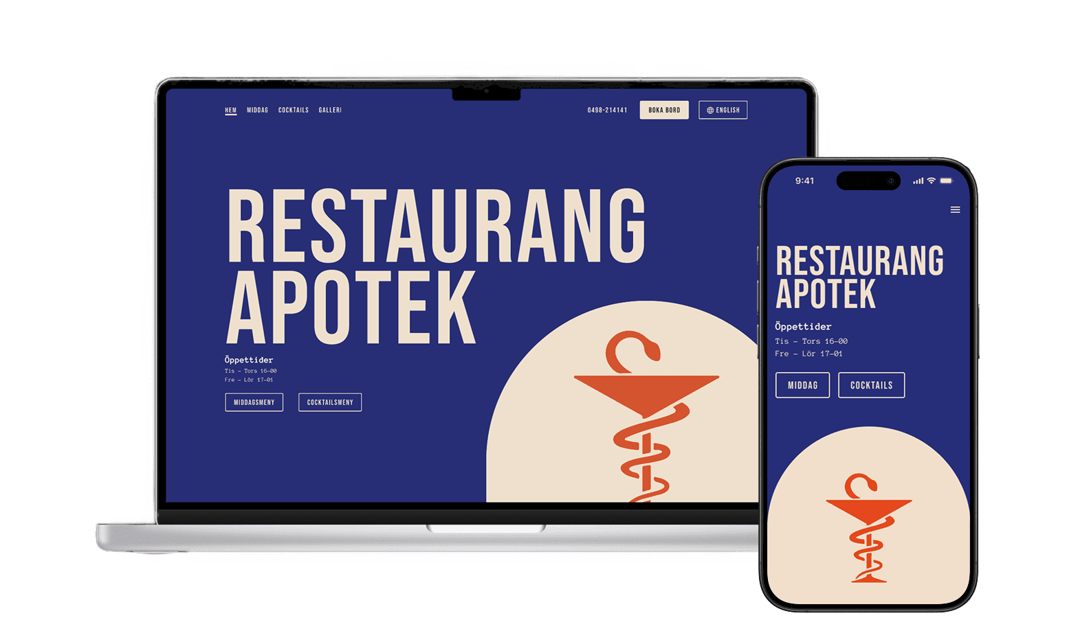
Landing Page
Clean hero section with immediate access to booking and essential information.
- •Clear visual hierarchy guiding users to key actions
- •Mobile-first design with touch-friendly elements
- •Bold imagery reflecting the restaurant's personality
Menus that work for everyone
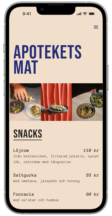
Food Menu
Clean layout with clear categories, pricing, and descriptions.
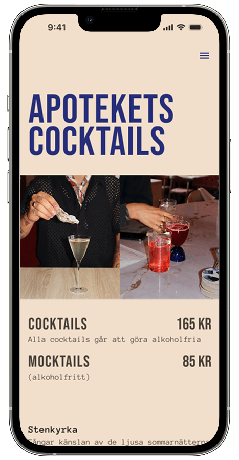
Cocktail Menu
Visual menu design highlighting drinks with proper categorization.

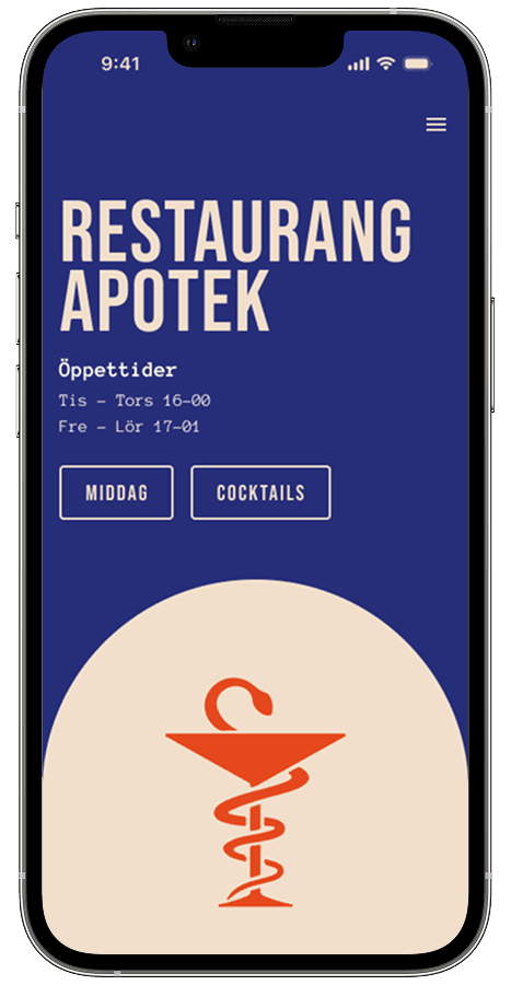
Mobile Navigation
The old navigation was cluttered and confusing. I redesigned it with clear structure, accessible touch targets, and a clean mobile menu that prioritizes the most important actions.
- •Prominent booking CTA at the top
- •Clear close button (X) for better usability
- •Phone number easily accessible
- •Large touch targets for mobile users
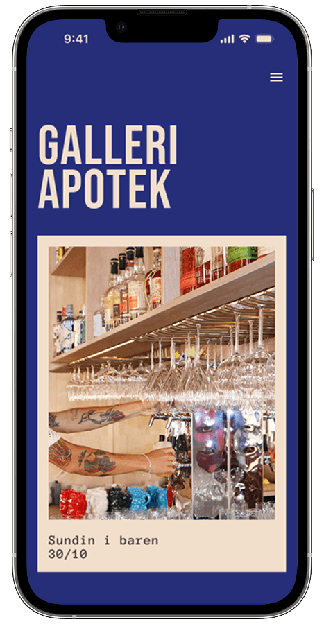
Gallery
Modern gallery layout showcasing dishes with responsive image handling and clear labeling.
- •Full-width layout that adapts beautifully on mobile
- •Soft hover states that match the brand’s tone
- •Lazy-loaded images for performance
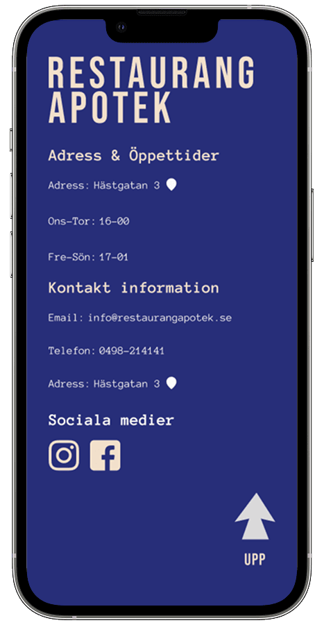
Footer
The footer became a crucial touchpoint for users looking for practical information. I designed it to be scannable, accessible, and mobile-friendly.
- •Clear grouping of information for easy scanning
- •Clickable phone numbers and email addresses
- •Social media links with proper labels
Testing and refining
What worked
- •Booking button became immediately findable
- •Navigation clarity improved significantly
- •Users described design as "clean and professional"
Impact
- •All users could complete booking flow
- •Keyboard navigation fully functional
- •Staff could update content without developer help
Key Insight: Mobile Navigation
Initially, the phone number and booking button sat at the very top of the navigation. Testing showed it felt like a "fast food chain" homepage and created confusion.
Moving these elements into the dropdown menu clarified the hierarchy, focused attention on primary navigation, and kept critical actions easy to find.
Lesson learned: The most prominent placement isn’t always the most usable—context and flow matter.
What I learned
"The more we aligned the visual experience with the physical restaurant, the more the digital experience felt authentic and trustworthy."
Accessibility opens doors
Building for accessibility from the start made the site better for everyone, not just users with disabilities. Clear navigation and semantic HTML improved the entire experience.
User testing catches blind spots
What seemed clear to me wasn't always clear to users. Testing revealed issues I would have missed, and their feedback shaped better solutions.
Mobile-first matters
Most users were browsing on mobile. Designing for small screens first ensured the experience worked where it mattered most.