Loggi Wellness App
2025 · UI/UX · Accessibility · Mobile
A 2-week concept sprint designing a calm, accessible wellness app for daily mood and sleep tracking.
Why another wellness app?
Most wellness apps feel overwhelming. They push you to track everything, gamify your emotions, and guilt you when you miss a day. I wanted to explore a different approach.
This was a 2-week concept sprint where I explored the full UX process, from defining user needs and emotional tone to prototyping and testing high-fidelity flows.
The core question: How might we design a daily wellness tool that feels calm, supportive, and emotionally safe while still helping users build consistent habits over time?
Who needs this?
Understanding the landscape
Key Insights
- •Users want quick check-ins, not 10-minute journaling sessions
- •Overly cheerful or pushy language feels inauthentic
- •Missing a day shouldn't feel like failure
- •Dark UI can create a calmer, more focused experience
Design Hypothesis
"If we create a check-in flow under one minute with gentle, supportive language and consistent visual rhythm, users will feel more in control of their wellness journey without the pressure."
Shaping the emotional tone
These principles guided every decision, from microcopy to button placement to transition timing.
Welcoming users without pressure
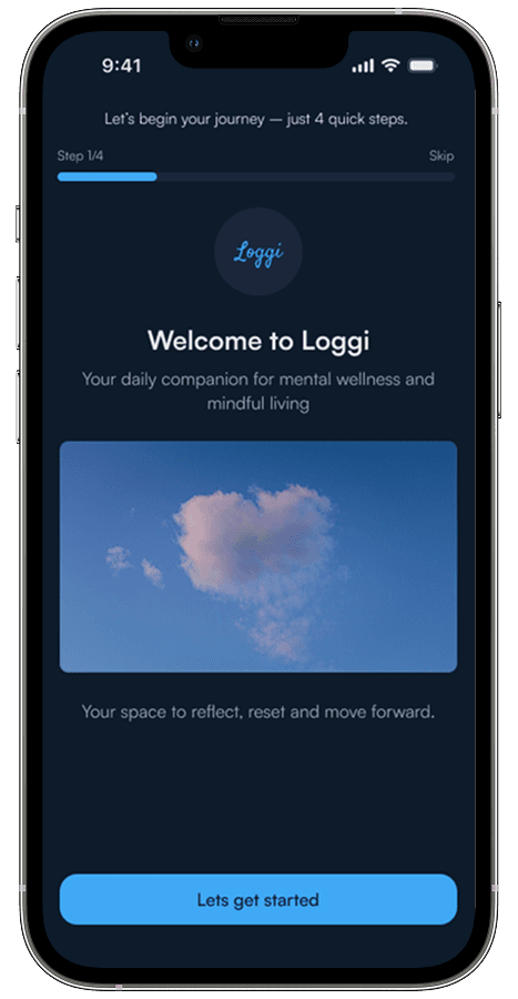
Welcome
Soft introduction
Purpose
Clear value
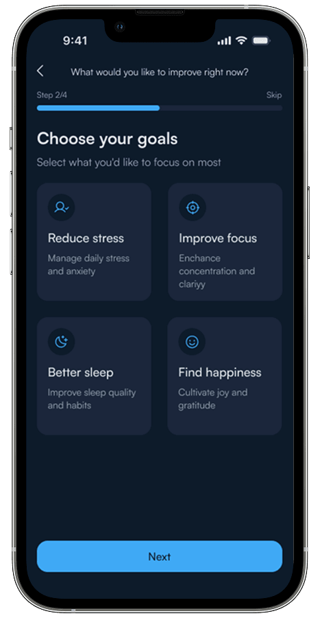
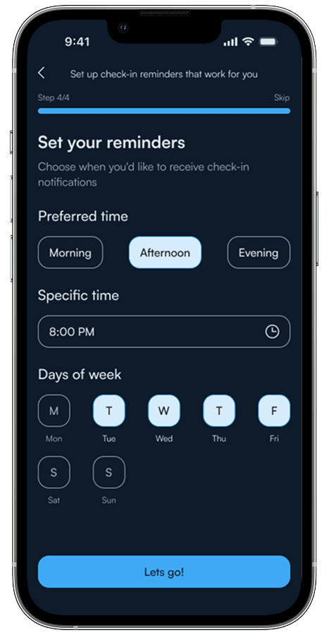
Preferences
Light setup
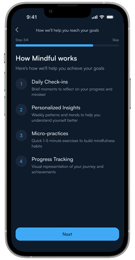
Ready
Encouragement
Each screen builds confidence. No clutter. No pressure. Just a gentle invitation to begin.
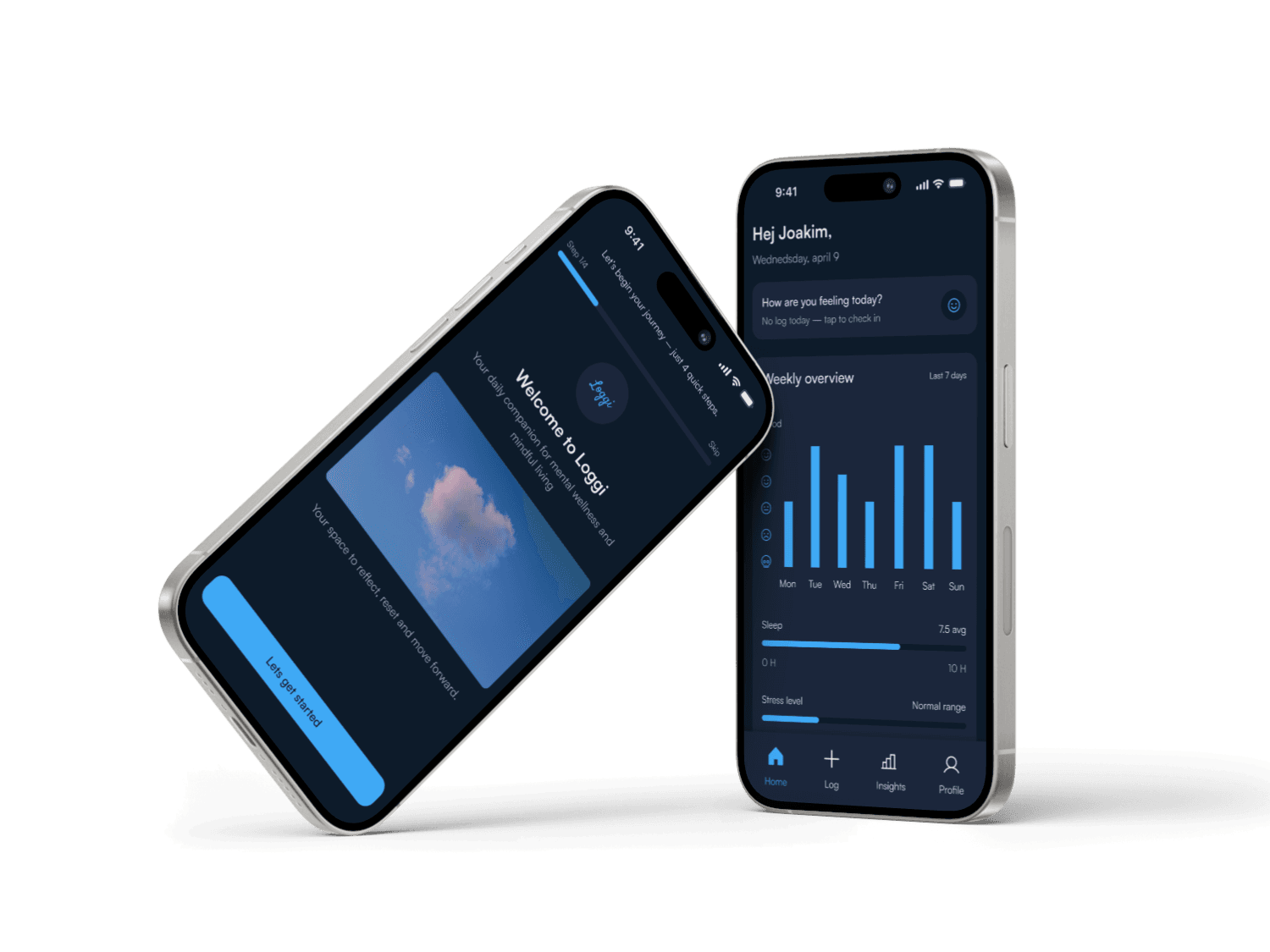
The heart of Loggi: Daily check-ins
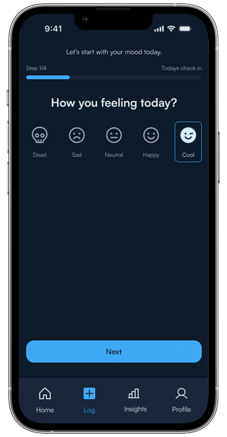
Mood
How are you?
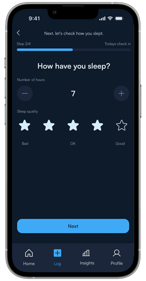
Sleep
How have you slept?
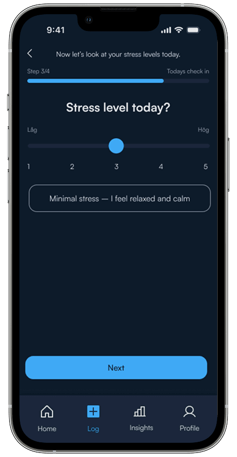
Stress
Stress level today?
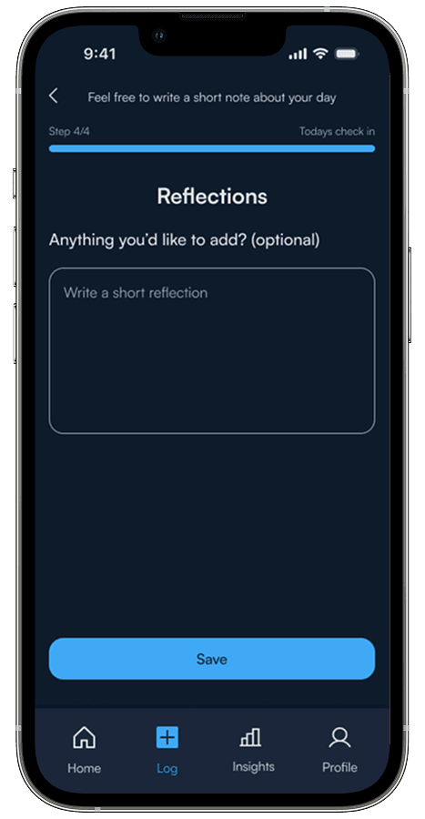
Reflection
Optional note

Complete
Thank you for checking in
Each step uses simple icons, clear labels, and supportive microcopy. The progress is visible but not overwhelming. Users can go back, skip, or pause anytime.
"The flow respects the user's time while gathering meaningful insights. No guilt. No pressure. Just care."
Seeing patterns over time
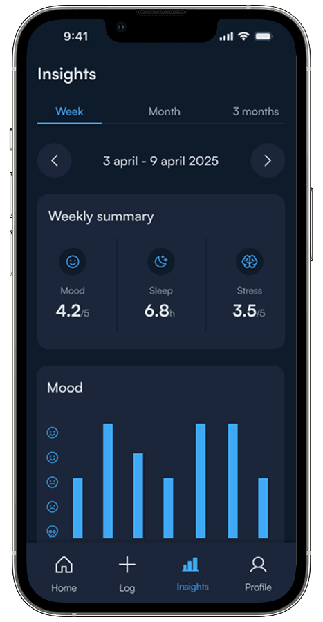
Insights
Visualized trends help users understand their mood and sleep patterns without feeling data-overwhelmed.
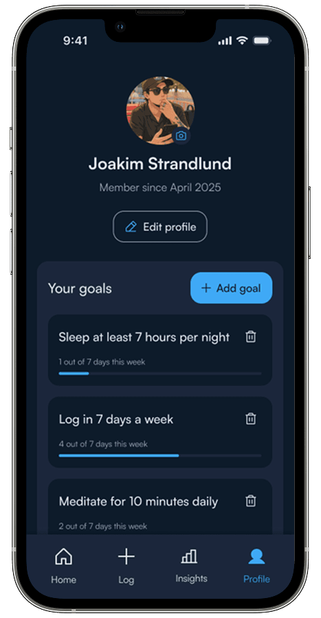
Profile
A clean, accessible space for users to manage preferences and personalize their experience.
Testing with real users
What worked
- •The tone felt "calm and approachable"
- •Check-in process was fast and easy
- •Visual clarity made navigation intuitive
What I improved
- •Made selected states more visually distinct
- •Changed "Next" button copy to more human language
- •Added back button and progress indicators
Key Insight: Microcopy Matters
Testing revealed that small changes in button copy had a huge impact. Changing "Next" to "Let's go" or "Complete" to "You're done" made the experience feel more human and supportive.
Lesson learned: Words aren't just information—they set the emotional tone of the entire experience.
What I learned
"This project proved how close collaboration between design, development, and business can create products that strengthen the brand and meet real needs in a traditionally analog industry."
Microcopy matters more than I thought
Changing "Next" to "Let's go" or "Complete" to "You're done" made the experience feel more human and supportive. Small words, big impact.
Visual rhythm creates calm
Consistent spacing, subtle animations, and dark UI all contributed to a feeling of "calm focus" that users mentioned in testing.
Less features, more clarity
I initially wanted to add journaling, meditation timers, and habit tracking. But keeping it simple made the experience more approachable.